The Story of the Cover: Katherine of Aragon, The True Queen by Alison Weir
Siobhan, from Headline’s Creative Department tells the story of the cover…Katherine of Aragon, The True Queen is the first book in Alison Weir’s Six Tudor Queens series.
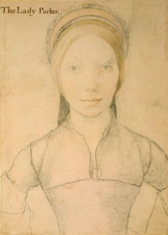
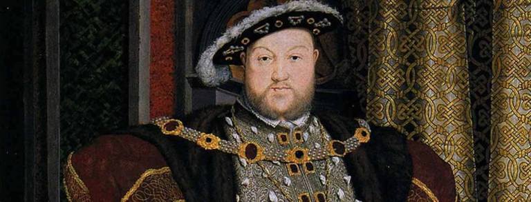
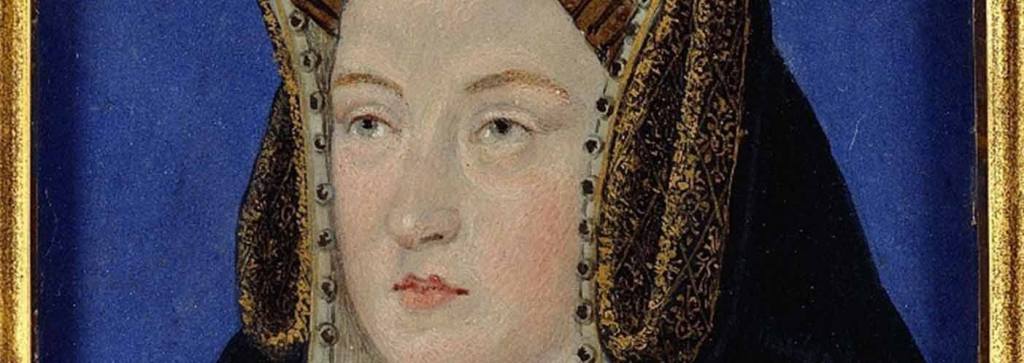
Being the first in the series of six books, it was key to establish a distinctive cover look that will follow through across the entire series.The brief was to move away from the photographic covers that are often found in this genre, and nod back to the classic portraits of Henry VIII’s wives. As this fictional series is bringing new life into the six queens, they needed to have a contemporary edge, whilst still maintaining the authenticity of the original portrait – quite a challenge!When working on an illustrative brief, the first step is to research illustrators who might be a good fit for the brief. I love working with illustrators as they are able to bring life to my ideas in a way I am unable to. They are experts in their given field for a good reason. I pulled together a number of suggestions to discuss with the editor, providing examples of previous work to show how they might be able to bring the brief to life.
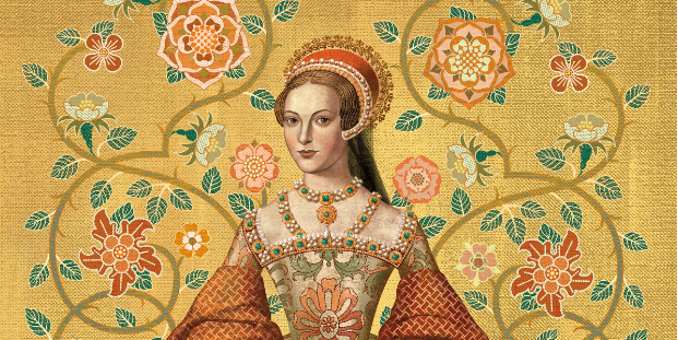
One suggestion I had in mind was the Balbusso Twins. I had admired Anna and Elena’s work for many years; the level of detail in their portraits is incredible, and for me they were the perfect fit. The editor and I were in agreement, so we were able to get the process of commissioning the artwork underway.
When briefing an illustrator, I try to give a pretty descriptive brief, providing plenty of visual references – which the author had helpfully provided in this instance – and visual inspiration, whilst allowing for plenty of room for personal interpretation. The first step is always to get a black-and-white rough visual in before working up in colour, so that there is an opportunity to make changes at this stage in the process. Once the cover has been approved, we then ask the illustrators to create the final artwork. Getting this final artwork in is always an exciting moment, particularly in this case, as there is so much captivating detail in the final painting.

With the illustration underway, the next step was to create the branding for the series. I had mocked up an option myself, but the best way to get the authentic period look we were after was to get a calligrapher/lettering artist involved. Stephen Raw was the natural choice for this, and he provided a range of rough visuals – experimenting with different letter styles and word formations until we came to a style that was liked by all. This style was then followed through to the title, subtitle and other lettering elements across the book, keeping a consistent look throughout.

With the illustration and lettering completed, then came the job of pulling it all together; how could we get the elements to work together in one cohesive cover? In the end we lead with the series title against a rich Tudor tapestry background, with the portrait fitting into a cameo style frame.
As the portrait of Katherine of Aragon now appeared much smaller on the cover, we wanted to find another way to show the full painting. The best way to do so was to include in the full-colour endpapers, which I think are incredibly beautiful. Below you can see how the final copy looks! We are now getting the artwork for the next book in the series, Anne Boleyn, underway – and can’t wait to show you what we come up with!


